CLIENT:
Starbucks Global Creative Studio
TEAM:
Kristy Cameron, Derek Shimizu, Charis Mori, Jasmin Nguyen, Sophie Kim, Gennyver Pacheco, Kevin Glover
ROLE:
Art Direction, Brand Strategy & Development, Social Media, Content Creation
Starbucks Global Creative Studio
TEAM:
Kristy Cameron, Derek Shimizu, Charis Mori, Jasmin Nguyen, Sophie Kim, Gennyver Pacheco, Kevin Glover
ROLE:
Art Direction, Brand Strategy & Development, Social Media, Content Creation
PROJECT:
The Starbucks Creative Studio Instagram︎︎︎ account was started in 2018 to share and celebrate the studio’s creative work with online art and design communities. After many years, the Studio IG team felt the account could do with a refresh. We took a strategic look at our content, visual language, and voice on the platform, identifing opportunities and our desired outcomes.
Opportunity ︎︎︎ The previous state of our account did not feel reflective of our studio and our potential. Posts felt inconsistent and veered too functional indicating we had drifted away from our original goals. An absence of set guidelines and templates also affected our content, especially when partnering with designers in the studio outside of our team. Ultimately, we lacked a clear articulation of our identity to the larger creative community.
Outcome ︎︎︎ A revamped Studio Instagram with a clear visual and written point of view, that solidifies our place in the creative landscape. Our updated Instagram content will amplifies our values of Craft, Belonging and Joy. This is the space to put ourselves out there and show off the thinking, the humanity, the stories that shape everything we make. Our feed is a living timeline of our work as strategic and creative problem solvers.
From this strategic work we knew that determining a clear look and feel for our feed was the first step to making our account more cohesive. We were challenged to create an idenity that felt:
︎︎︎Design forward and distinct from other Starbucks channels
︎︎︎Still grounded in the Starbucks brand
︎︎︎Broad enough to support both Studio branded content and act as a neutral base for visually distinct and varied projects

Creative Expression
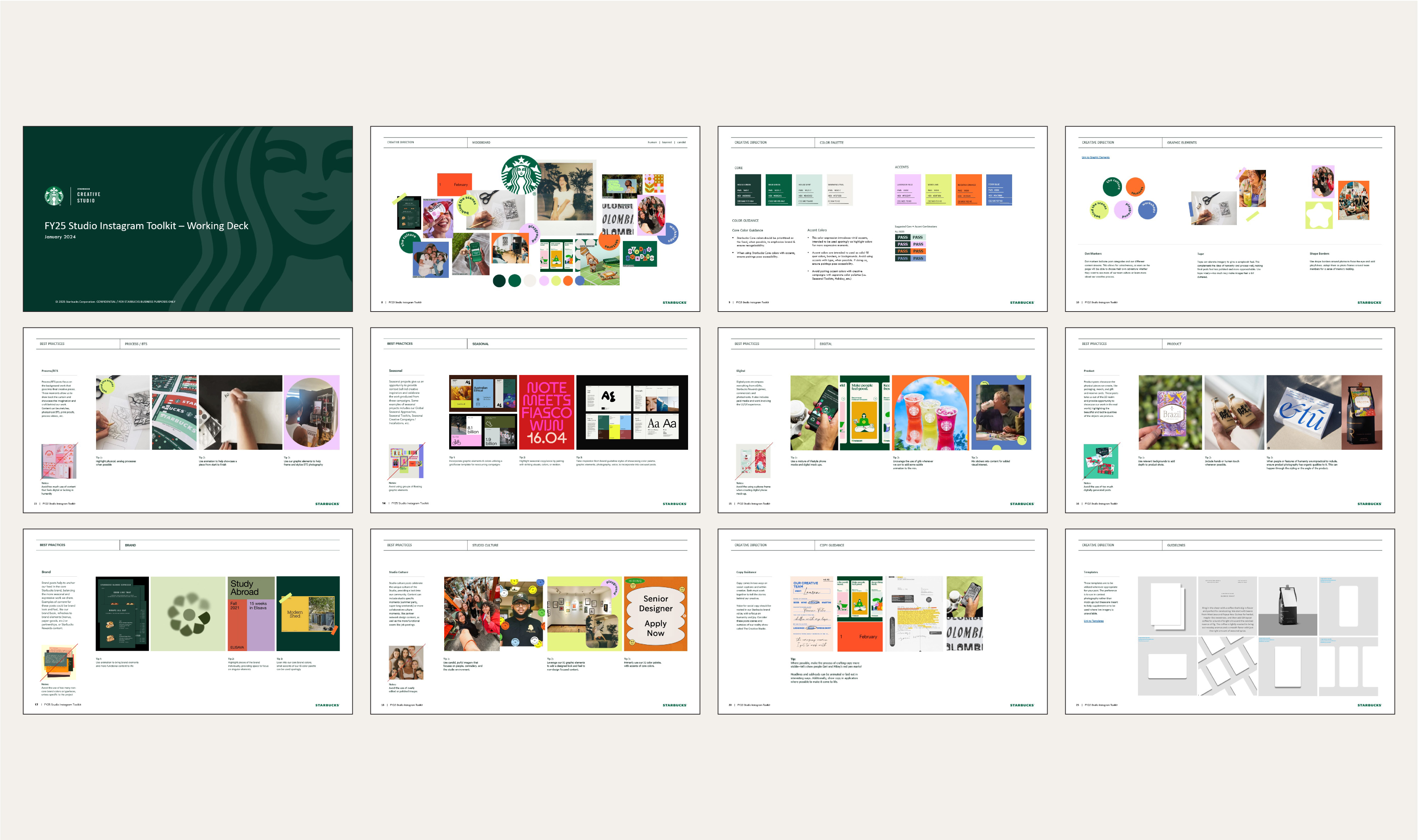
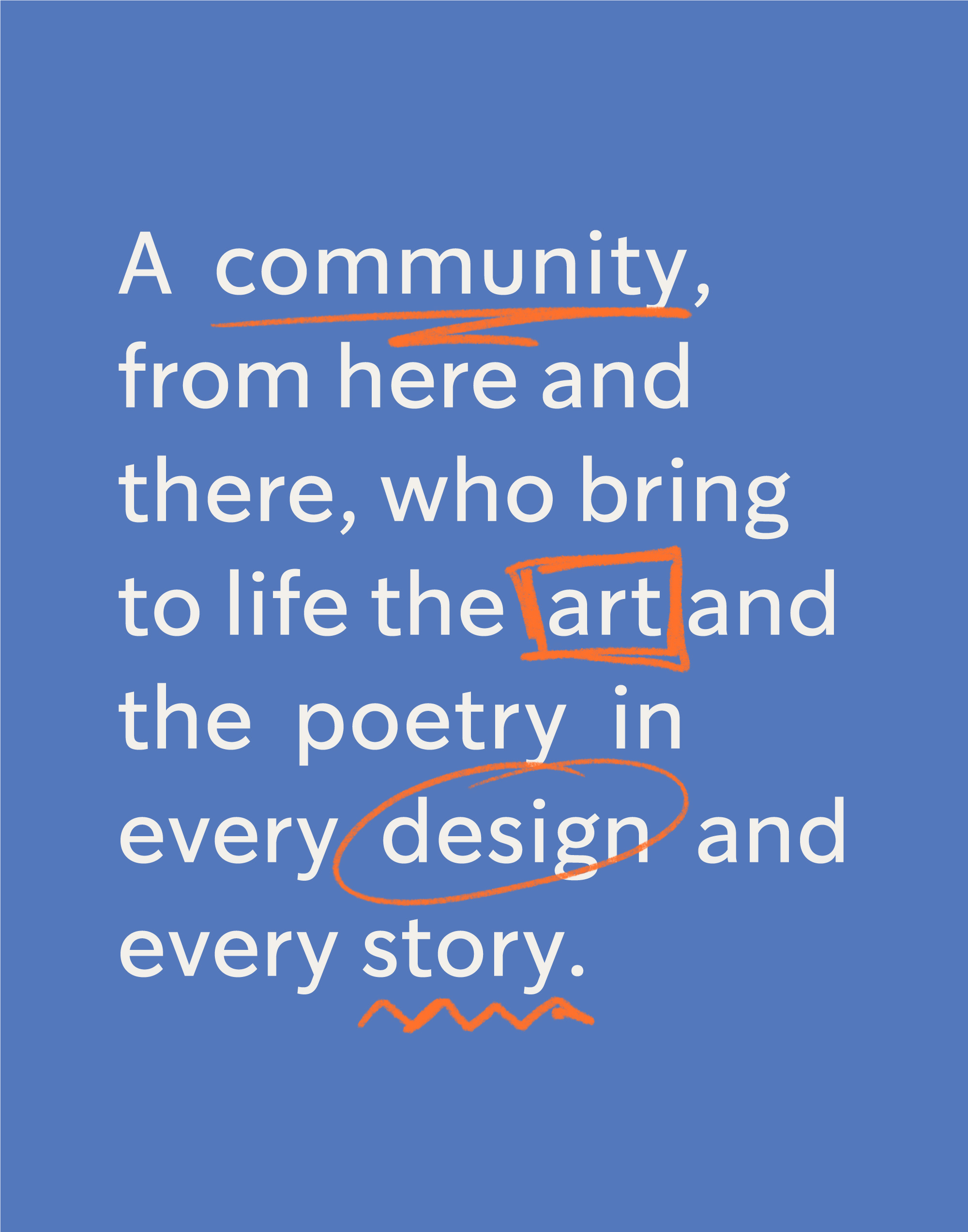
For the Studio IG brand we wanted it to feel joyful, candid, and visually layered, reflective of the moodboard we created.
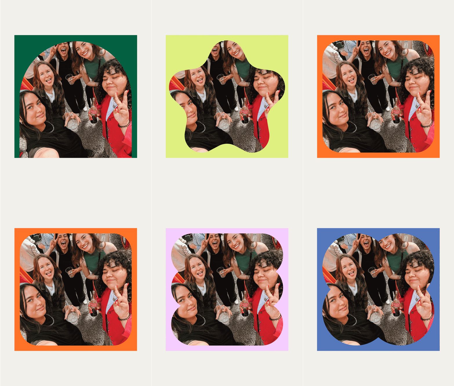
Our color palette is grounded in Starbucks greens, with 4 bright tones to visually set us apart and tie together our feed cohesively. Additionally, we developed a set of graphic elements that can be used to create recognizable visual themes across the many projects on our grid; such as, dot stickers, tape, and shaped borders.
As part of this work we put together a comprehensive toolkit, as a resource for our Instagram team and fellow Studio members. Within it we set clear guidelines for visuals, project content, and storytelling, and provide started mockups for posts.
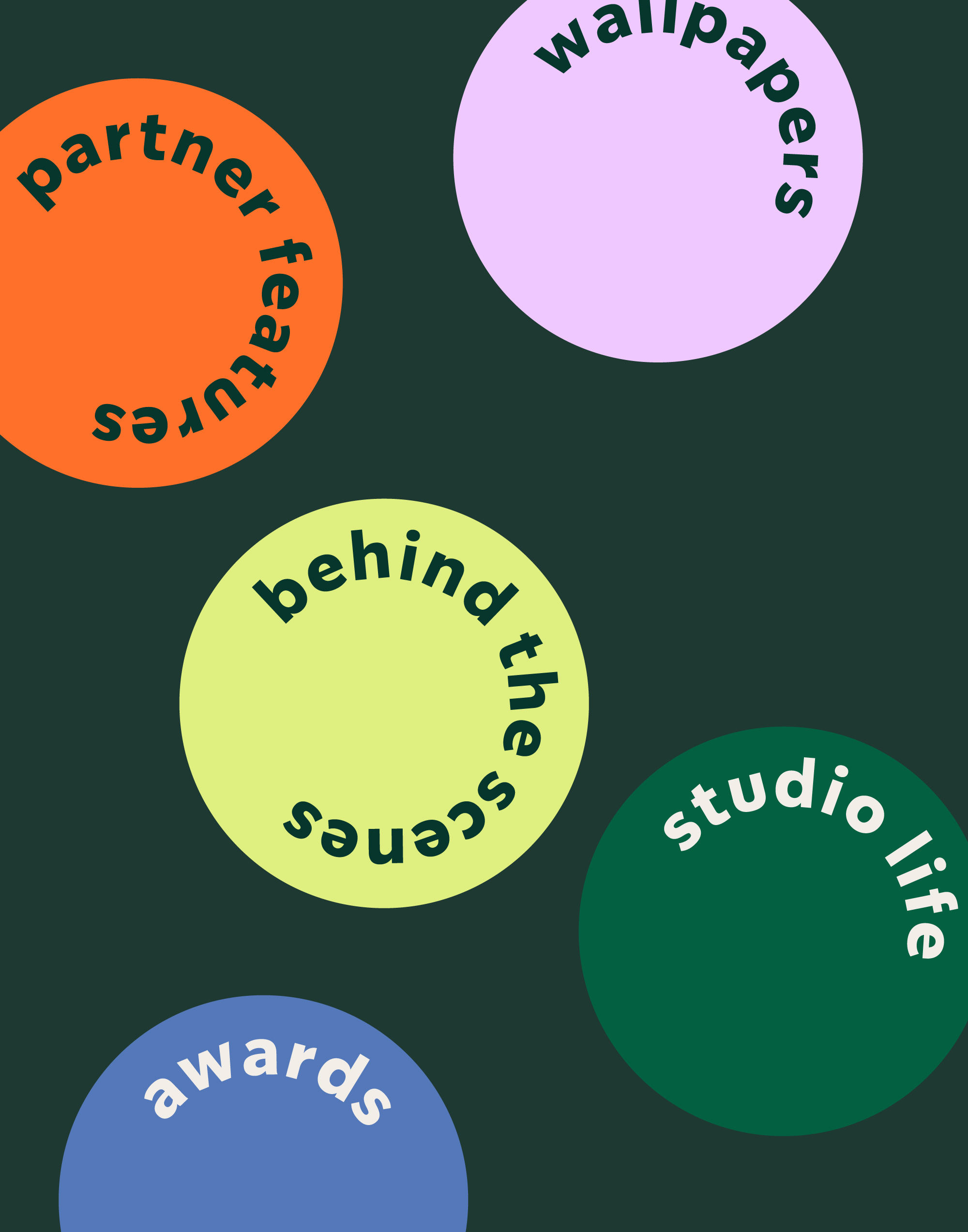

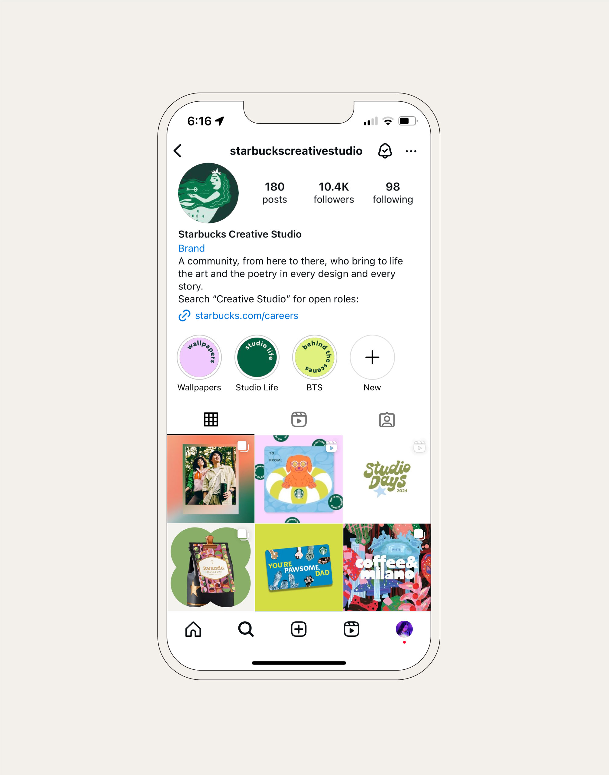
Profile Anatomy
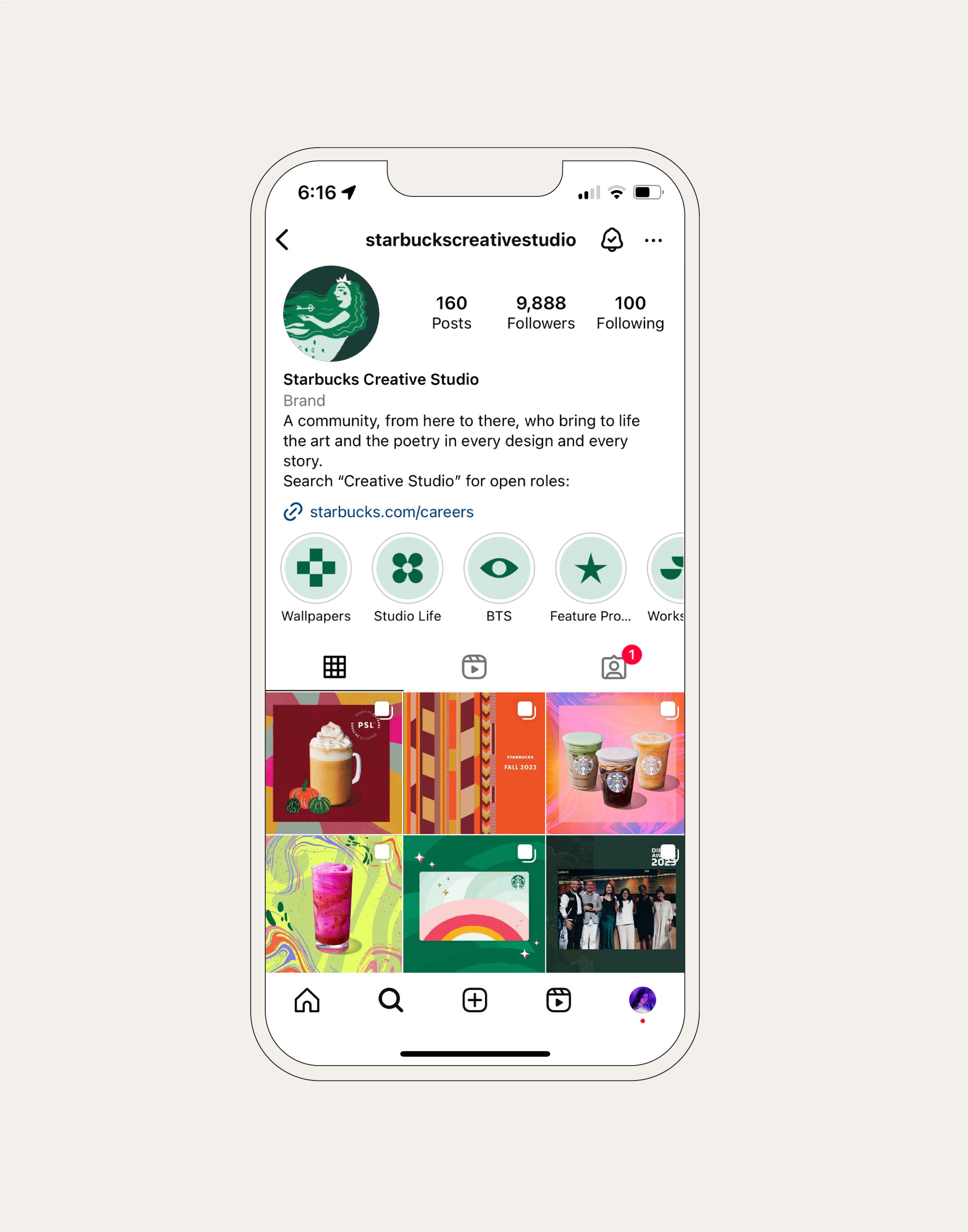
In updating our profile, we replaced old, vague iconography with our brand dots, which feel more relevant to our content and anchor our profile in the new visual approach.
Scroll to see previous profile anatomy ︎︎︎
Scroll to see previous profile anatomy ︎︎︎
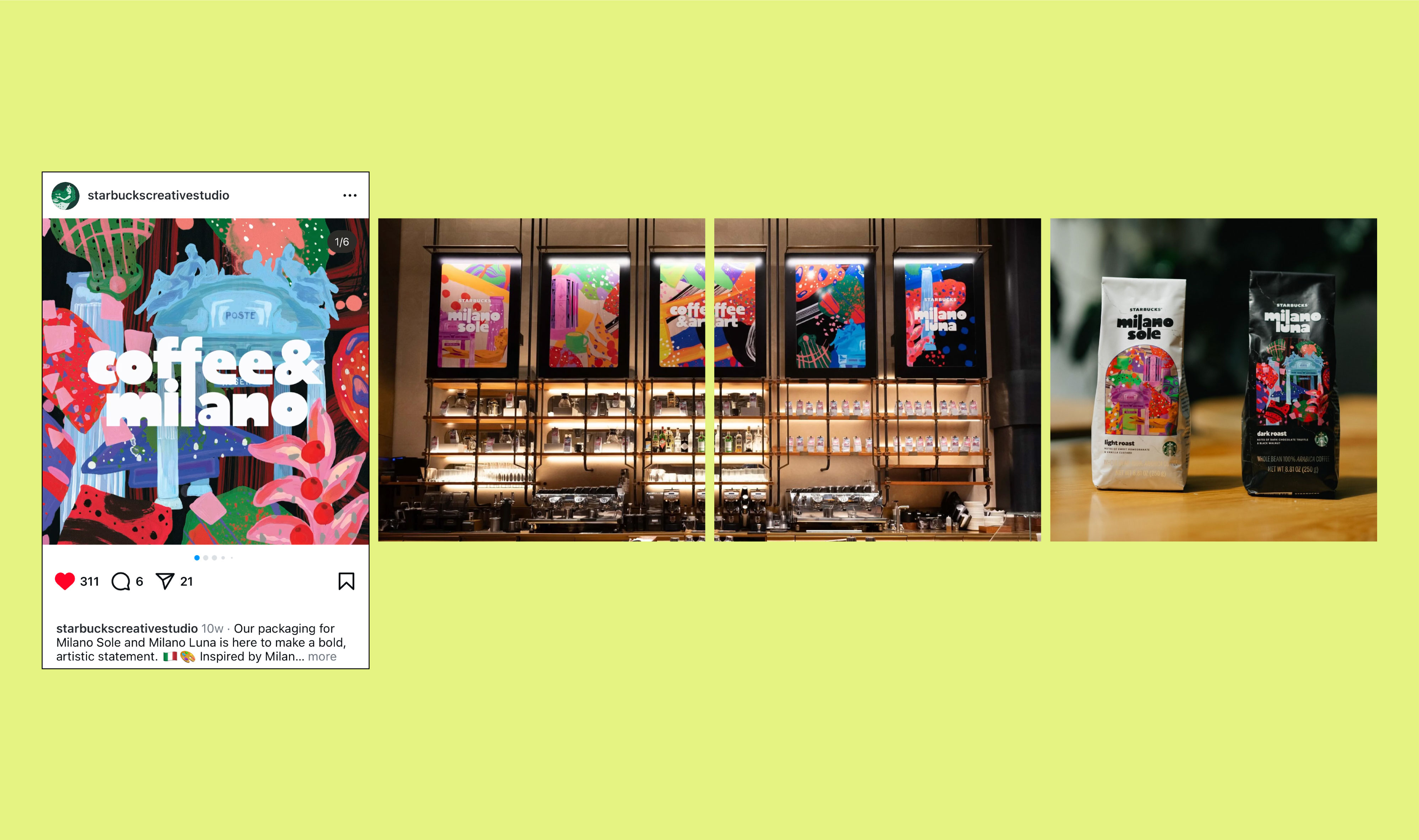
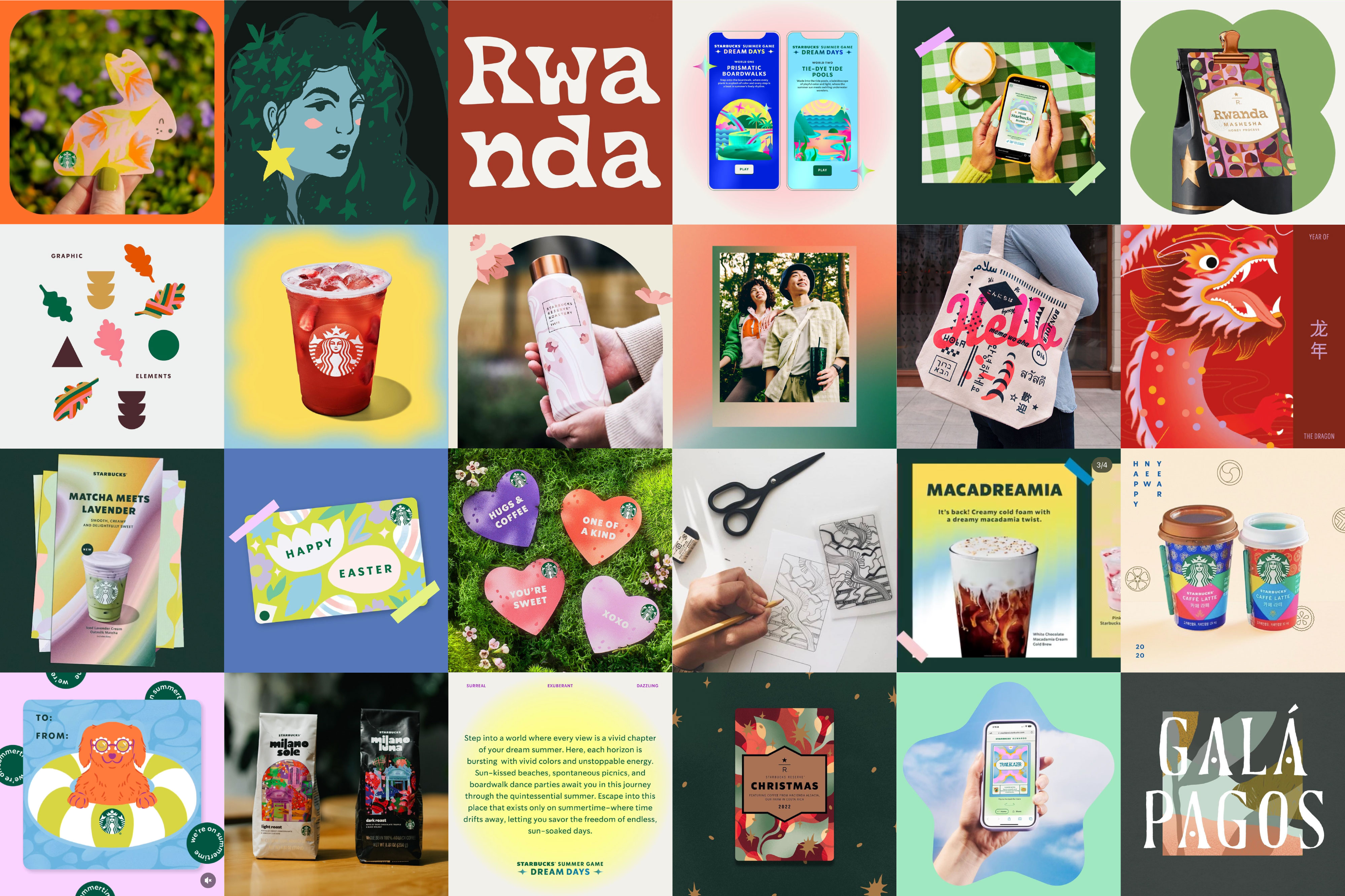
In-feed
Our in-feed content primarily showcases the wide range of work we tackle in the Creative Studio. The aim for these posts is not only to share our favorite projects, but also to give our followers a look behind the curtain of our creative processes. We include concept
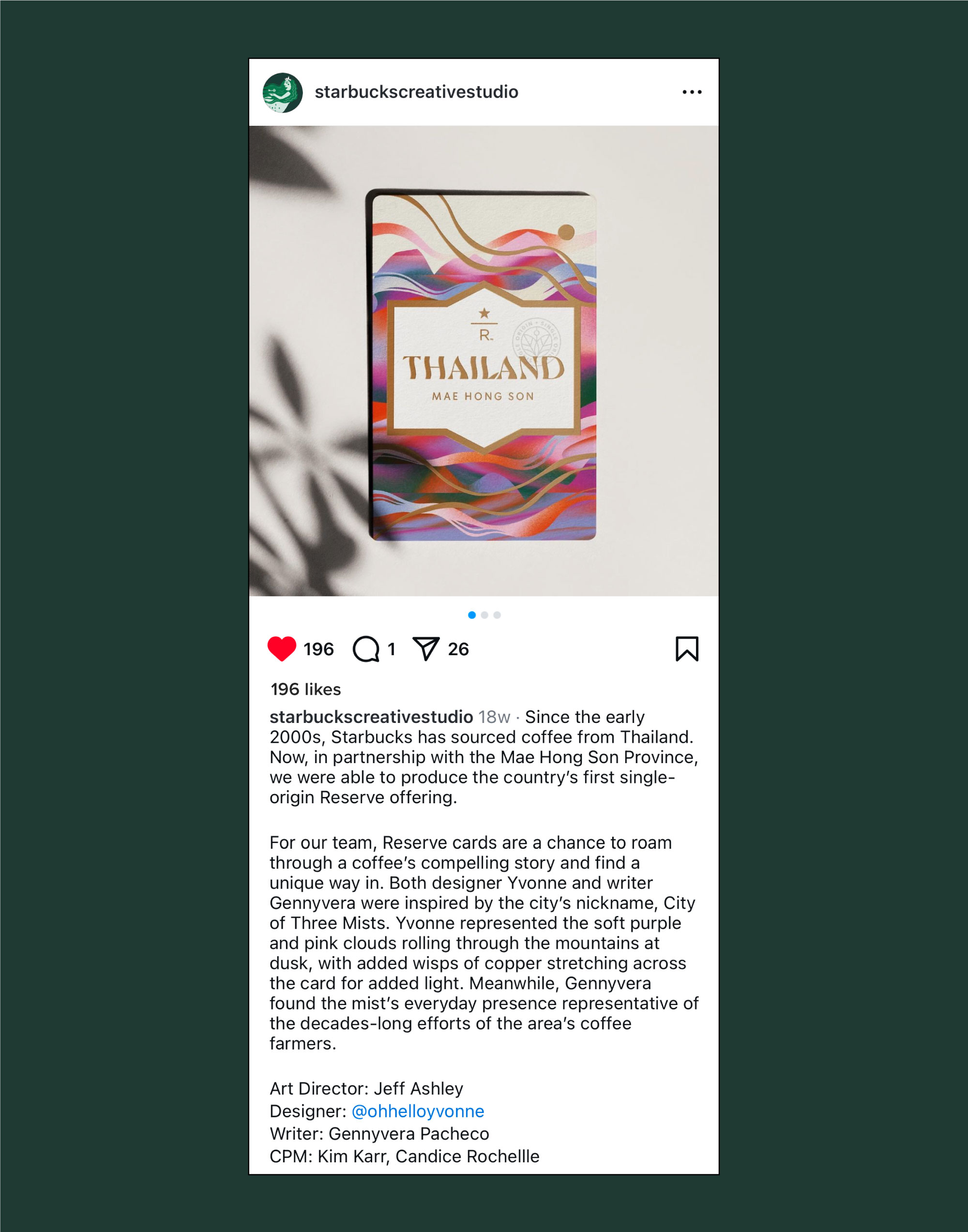
Captions help us bring to life the story of the creative process.
we shifted our writing style to a more relatable tone, including quotes from designers or inspiration and bts notes that allowed us to lean into storytelling.
Scroll to see previous caption style ︎︎︎
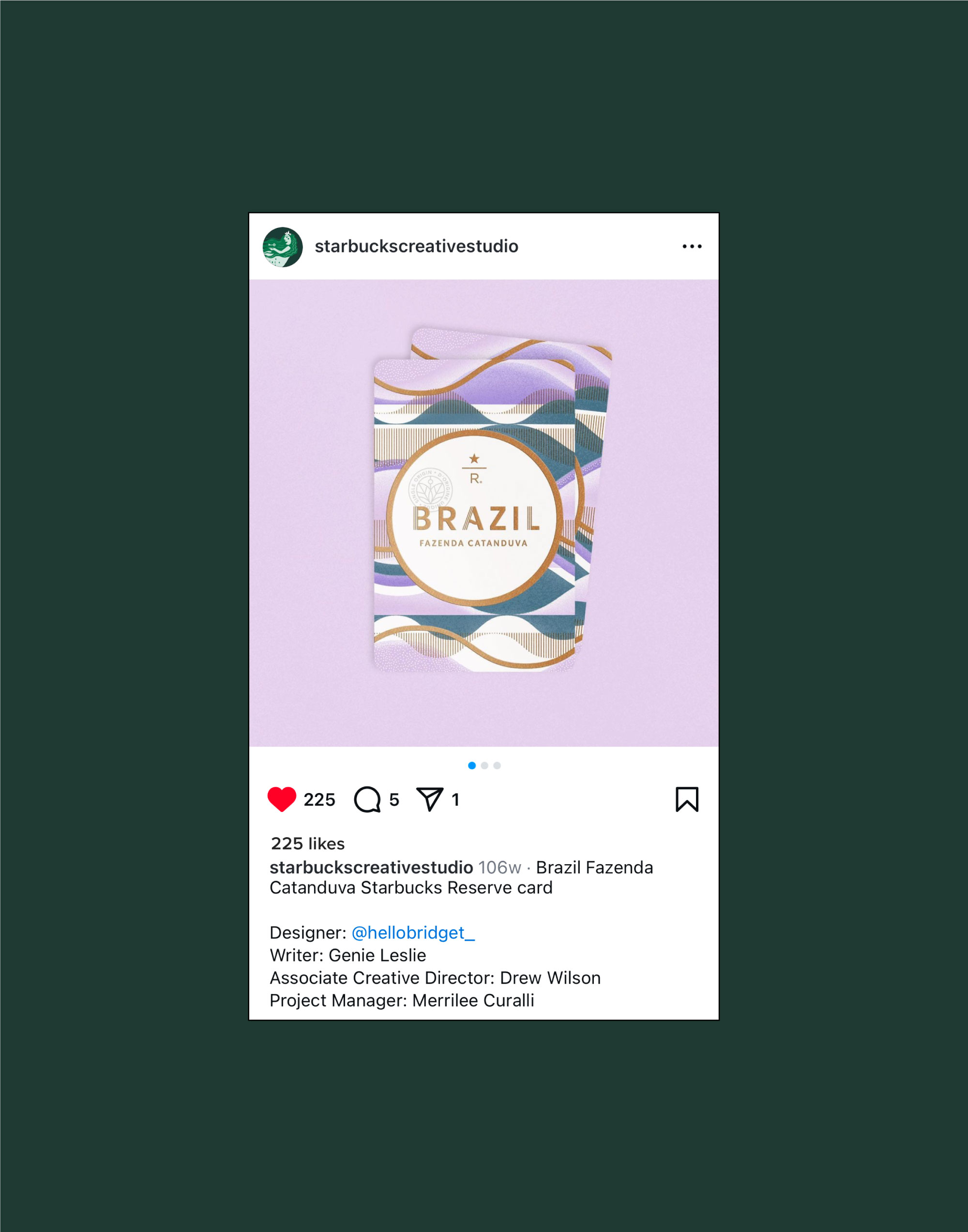
Captions help us bring to life the story of the creative process.
we shifted our writing style to a more relatable tone, including quotes from designers or inspiration and bts notes that allowed us to lean into storytelling.
Scroll to see previous caption style ︎︎︎
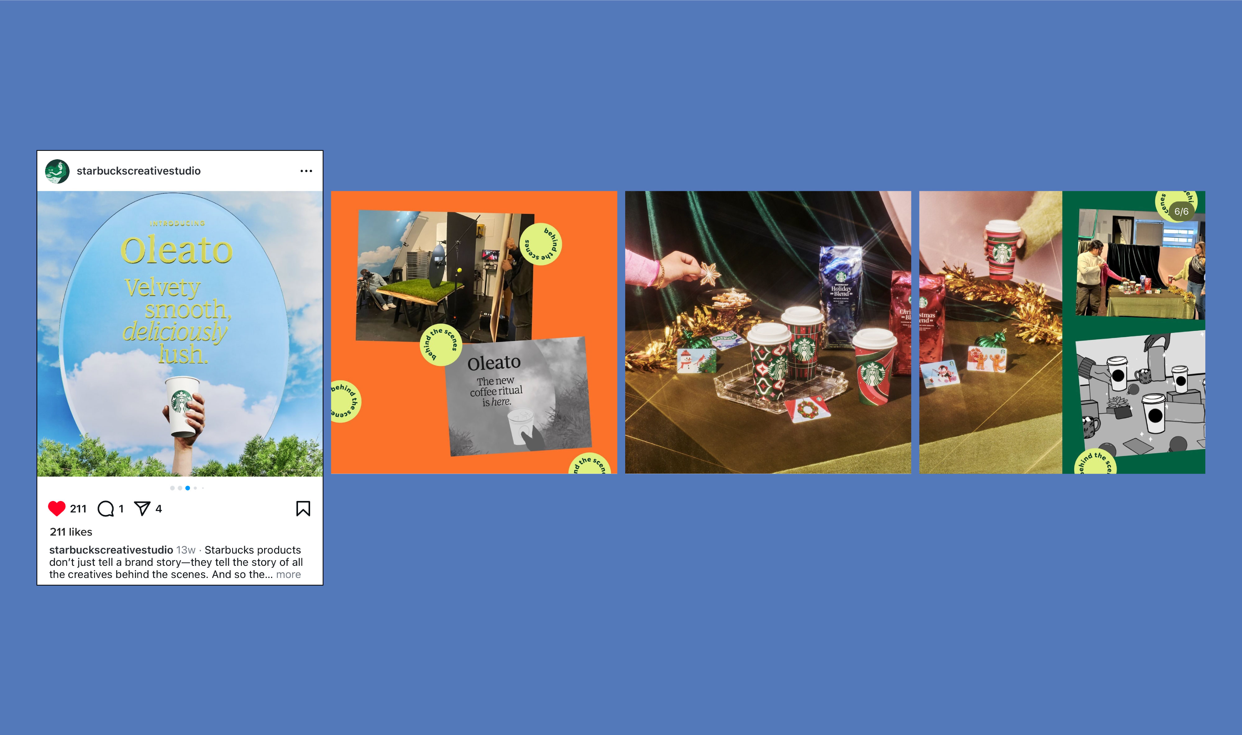
Stories & Reels
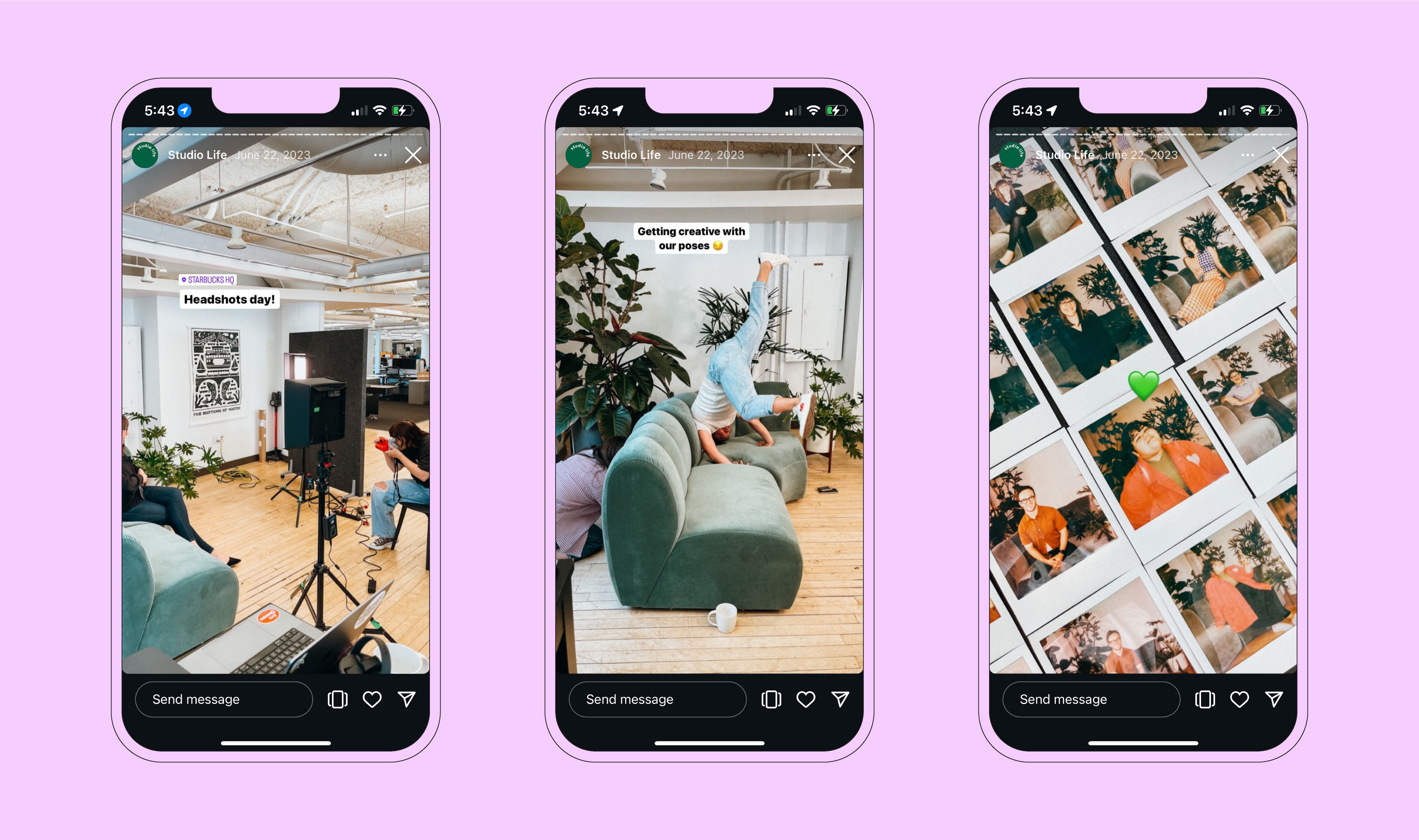
Our stories and reels are a space where we showcase candidly showcase our personality and Studio culture. Highlighting Studio events, partners, activities, bts content, and more!
